
How to Mix Wood Tones Without Everything Looking Mismatched
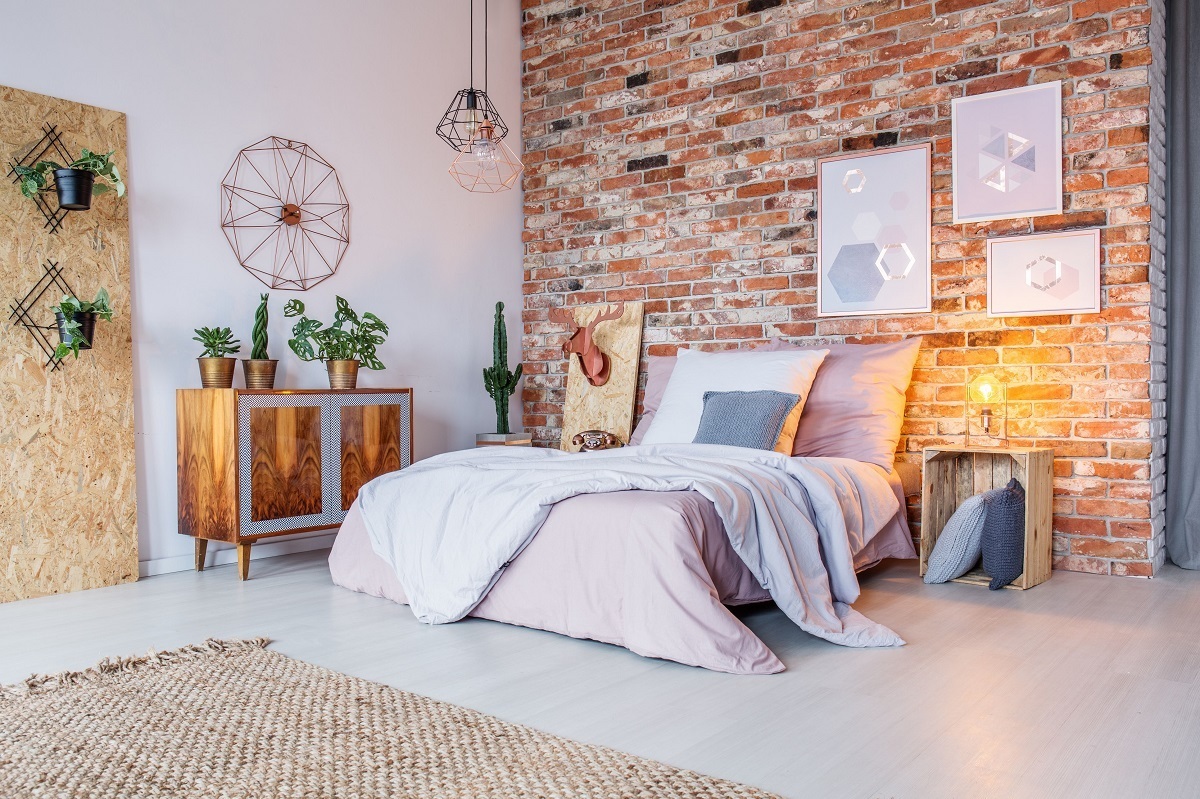
Matching all your wood furniture used to be the gold standard. Your coffee table, bookshelves, and dining chairs all had to share the exact same stain, or decorators claimed your home would look chaotic. That rule is gone, but the freedom to mix has created a new problem: living rooms that look like furniture store floor samples thrown together at random. The key is intentional mixing. When you combine wood tones with purpose, you create depth and warmth that matched sets simply cannot achieve.
Start With Your Anchor Piece
Every room needs a dominant wood tone that takes up roughly sixty percent of the wooden surfaces. This is usually your largest furniture item—the floor itself, a built-in bookshelf, or a substantial dining table. Once you identify this anchor, everything else becomes an accent to it.
If you have medium-tone oak floors, they become your baseline. You would not want to add another medium oak coffee table and matching side tables, as that creates a flat, monotonous look. Instead, choose a coffee table that is noticeably lighter or darker. This contrast creates visual layers that draw the eye around the room.
Check the Undertones
This is where most people go wrong. Two woods can be different shades but still clash violently if their undertones fight each other. Wood falls into three undertone categories: warm (yellow, orange, or red undertones), cool (gray or blue undertones), and neutral (true brown or beige).
Walnut with its chocolate warmth will look jarring next to gray-washed driftwood. Similarly, cherry wood with its red undertones can make pale birch look sickly and yellow. If you inherited a warm pine dresser but love the look of cool weathered barn wood, you do not have to choose. You can bridge them by adding a third wood that sits in the middle of the spectrum, or by introducing fabrics and metals that reference both temperatures. Hold samples next to each other in natural daylight. If they look like they come from different forests entirely, they probably do not belong in the same sightline without a buffer.
Use Contrast, Not Confusion
Aim for at least two to three shades of difference between your wood pieces. A dark espresso console table against pale maple floors creates a satisfying contrast. Three medium-brown woods that are slightly different but not different enough just look like failed attempts at matching.
Think of it like piano keys. You want distinct blacks and whites, not thirty-two slightly different grays. If you have a light oak dining table, pair it with black walnut chairs, not birch. The gap between them makes each tone look richer and more intentional.
Create Visual Breaks
Wood needs breathing room. When different tones sit directly against each other with nothing in between, the contrast can feel accidental rather than designed. Use rugs to separate wood floors from wood furniture. Place a table runner between a wooden dining table and wooden chairs. Upholstered headboards do wonders for breaking up the wood of a bed frame from the wood of nightstands.
Metal and glass also serve as excellent neutral mediators. A brass lamp between two different wood tones, or a glass coffee top on wooden legs, gives the eye a rest and prevents the space from feeling like a woodshop.
Common Mistakes to Avoid
- Placing two similar but not identical woods side by side, like teak and oak that are nearly the same value but different grains.
- Ignoring the wood trim in your home. If you have honey-colored baseboards, very cool gray woods elsewhere will feel disconnected.
- Overlooking wood art frames and accessories. A dark mahogany picture frame on a pale pine mantel counts as a wood tone and needs to coordinate with the room’s scheme.
Mixing wood tones is less about following rigid rules and more about developing an eye for harmony. Start with your dominant piece, check those undertones, and aim for clear contrast rather than near-matches. When in doubt, add a textile or metallic element between questionable pairings. The goal is a collected look that suggests you gathered pieces over time because you loved each one, not a showroom set purchased in a panic. Your home will feel warmer, more interesting, and distinctly personal when you let wood tones live together naturally.